Project scope
With streaming services growing each year the tactics used by the industry to exploit both fans and artists alike becomes more apparent, and the alternative options for music listeners disappear. Vinyl is the only other form of growing music consumption making it the perfect medium to innovate the music landscape. By renovating the record player it creates opportunities for the next generation of vinyl collectors to interact with one another and the artists they love. Generating a greater music community engagement and faster community growth.
Value Proposition
Vityl is a next generation record player system that enables vinyl collectors to discover exclusive limited edition content that generates higher revenue for the artist while honoring their most valued fans, unlike Spotify, Youtube, and SEV Litovel.
Scope of All Data
I used my connections within social media communities in order to get my survey out to as many college students as possible. When collecting data from artists themselves, I watched interviews other people had given famous artists like Adele or James Blake and took notes as if I was the interviewer.
2073 Responses
Data Collected
I used my connections within social media communities in order to get my survey out to as many college students as possible. When collecting data from artists themselves, I watched prior interviews artists like Adele had done and took notes as if I was the interviewer.
165 Responses
165 Responses
1,040 Responses
1,398 Responses
248 Responses
“The industry is a death trap”
-Adele
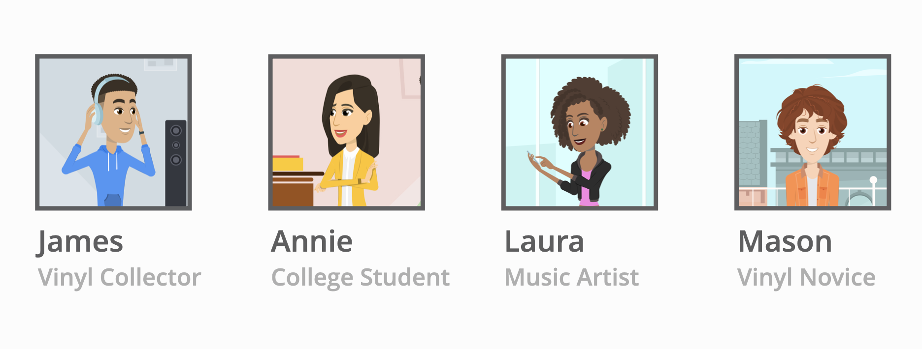
Design Fiction Characters
Design Fiction
Laura just spent the last eight months working on her new album, and is both eager and nervous to see her fans reaction.
James, Annie, and Mason have all been eagerly anticipating the a new album, and immediately all three of them start listening on their phones.
Annie and James also go onto Laura’s site to purchase a vinyl copy of the album as well.
Laura is excited to see all the positive feedback from her fans and quickly gets back in the studio to start working on the deluxe edition.
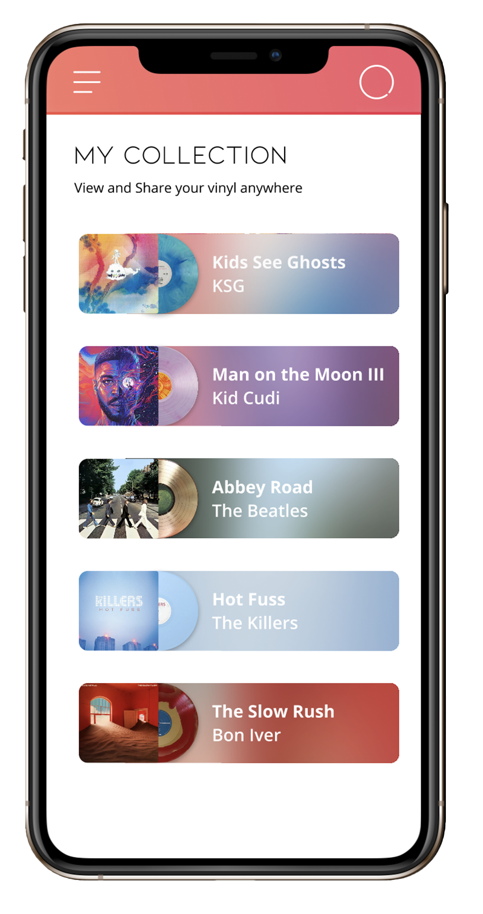
After receiving the vinyl, James places it on his record player. This action adds the vinyl to his digital collection on his smartphone.
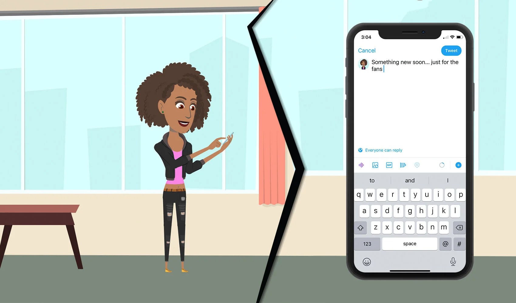
Laura almost done with her deluxe edition goes to Twitter to hint that she has a new Vityl album egg release coming soon.
Both James and Annie’s record player, through a color change notifies them that there is a new album egg unlocked.
James and Annie like to compete to solve eggs. Annie likes to try to figure it out on her own, while James often collaborates with others.
On social media Mason sees everyone is posting about these coded messages and is confused as to what they are all about.
After face-timing Annie, Mason sees that by purchasing the vinyl, fans unlock the ability to be able to gain exclusive early access to content.
Mason already wanting more content from his favorite artist, purchases the vinyl himself, and later begins taking part in the album egg.
Later that night, James calls Mason over in order to try to be the first to solve what they believe to be the final step of the album egg.
Laura sees that her fans are struggling with the final step and decides to send out a hint to both joke with and help them.
Annie sees the hint and immediately runs over to her record player, setting the speed to 45 rpm and revealing a secret message.
Annie successfully solves the last step of the album egg, making her the first person able to listen to the deluxe edition of Laura’s album.
Annie goes to social media to show her achievement, and tell other fans how to solve the last step as well.
James, Mason, and Laura all see Annie has been the first to solve the final step to the easter egg.
James and Mason quickly go to play the deluxe. James record player is able to connect with the tv in order to play the animated short Laura made to go with her new release.
User Flows
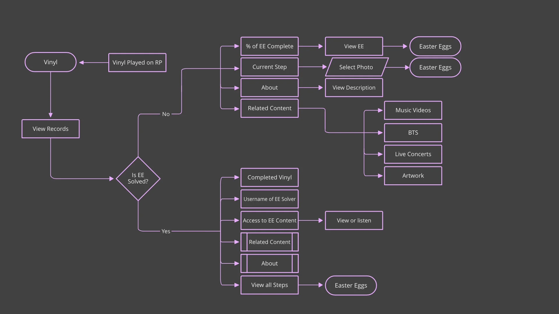
Before creating each of my final user flows, I sat down and sketched each on individually first. In doing this I find it accentuates the most important part of user flow for the UX designer in how it allows for you to think about how your screens and user will connect twice, generating opportunity to add things that would otherwise be missed.
Sketching
For my sketches I also identified each individual asset appearing on the screen with it’s function and for buttons location that screen would lead. I find that this more information architectural approach to the sketching process allows me to clearly pinpoint and lineup the user flows and sketches, making it as linear as possible to move throughout the development.
From sketching, user feedback, and competitor analysis, I was able to take the best parts of music products and remove the features that user’s found to be cluttered or in the way. One of the biggest problems user’s had with apps like Spotify was the inflated amount of album covers, that they felt took away from the emphasis album covers should have. Using a larger album cover, and the vinyl itself as the call to action, it helps bring greater emphasis back to the art of the album cover.
UI comps
After getting feedback from other UX designers and looking further at different UI, I decided I wanted to reimagine my comps to have a less minimal and more modern feel. I focused more in on the glass morphism style, as after benchmarking other music products that seemed to be the most current design ui choice, and in doing so would make my user’s feel more comfortable thanks to prior conceptual models with music apps.
Final Prototype
The mobile prototype was created using Figma, and connects to the user’s record player in order to stay up to date with what new music they are spinning.


